Materials for Class 5
- Download for offline use (open these using your web-browser)
General
Annoucements
- Next set of readings to be posted soon.
- Homework 1 will be posted in the next day or so.
Last time…
Data visualization as communication
Effective communication ↔ effective visuals
Difference between a clear message about your data versus a confusing one
Important decisions can hinge on how persuaded people are with your presented work!
Going against plotting conventions, even if the data is literally accurate, can be misleading
Caveat emptor: breaking visual conventions can be a deliberate strategy, approach with caution and careful skepticism
Principles and ethics for scientific visualizations
- Present your results transparently and honestly
- Show all data, including outliers, that are valid measurements
- Use graph layouts that show trends and lets readers easily read quantitative values
- Do not break conventions regarding scaling, axis orientation, the type of plot to use, etc.
- If you leave something out of a visualization, say so and justify it
- Strongly consider including your datasets and any scripts used to create figures with your reports or journal articles
Data visualization as exploration
library(tidyverse)
mpg| manufacturer | model | displ | year | cyl | trans | drv | cty | hwy | fl | class |
|---|---|---|---|---|---|---|---|---|---|---|
| audi | a4 | 1.8 | 1999 | 4 | auto(l5) | f | 18 | 29 | p | compact |
| audi | a4 | 1.8 | 1999 | 4 | manual(m5) | f | 21 | 29 | p | compact |
| audi | a4 | 2.0 | 2008 | 4 | manual(m6) | f | 20 | 31 | p | compact |
| audi | a4 | 2.0 | 2008 | 4 | auto(av) | f | 21 | 30 | p | compact |
| audi | a4 | 2.8 | 1999 | 6 | auto(l5) | f | 16 | 26 | p | compact |
| audi | a4 | 2.8 | 1999 | 6 | manual(m5) | f | 18 | 26 | p | compact |
The scatterplot
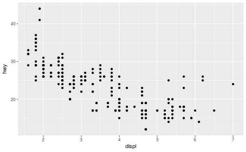
Plot each car’s highway fuel efficiency (hwy) as a function of the engine size (displ):
ggplot(data = mpg) +
  geom_point(mapping = aes(x = displ, y = hwy))
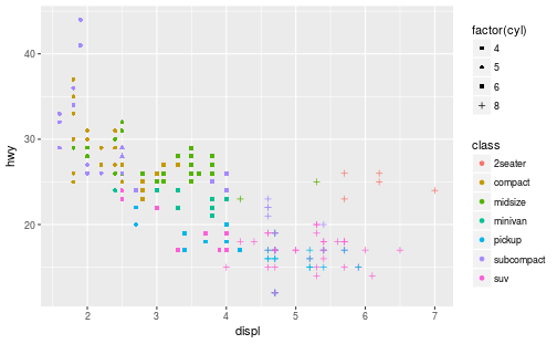
Layering details
ggplot(data = mpg) +
  geom_point(mapping = aes(x = displ, y = hwy, color = class, shape = factor(cyl)))
How to describe visualizations
A taxonomy for data graphics
We can break visualizations down into four basic elements:
Visual cues
Coordinate system
Scale
Context
Visual cues
These are the building blocks of any given visualization.
Identify 9 separate visual cues.
Cues 1–3
Position (numerical) where in relation to other things?
Length (numerical) how big (in one dimension)?
Angle (numerical) how wide? parallel to something else?
Cues 4–6
Direction (numerical) at what slope? In a time series, going up or down?
Shape (categorical) belonging to which group?
Area (numerical) how big (in two dimensions)?
Cues 7–9
Volume (numerical) how big (in three dimensions)?
Shade (either) to what extent? how severly?
Color (either) to what extent? how severly? Beware of red/green color blindness.
Coordinate systems
Cartesian This is the familiar (x, y)-rectangular coordinate system with two perpendicular axes
Polar: The radial analog of the Cartesian system with points identified by their radius ρ and angle θ
Geographic: Locations on the curved surface of the Earth, but represented in a flat two-dimensional plane
Scale
Numeric: A numeric quantity is most commonly set on a linear, logarithmic, or percentage scale.
Categorical: A categorical variable may have no ordering or it may be ordinal (position in a series).
Time: A numeric quantity with special properties. Because of the calendar, it can be specified using a series of units (year, month, day). It can also be considered cyclically (years reset back to January, a spring oscillating around a central position).
Context
Annotations and labels that draw attention to specific parts of a visualization.
Titles, subtitles
Axes labels that depict scale (tick mark labels) and indiciate the variable
Reference points or lines
Other markups such as arrows, textboxes, and so on (it’s possible to overdo these)
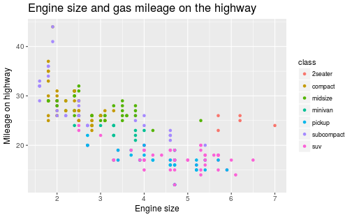
Example plot
How many of the previous elements can you identify in this plot?

More on ggplot2
Add facets
Split your plot into “facets”; particularly useful for categorical variables.
ggplot(data = mpg) +
  geom_point(mapping = aes(x = displ, y = hwy)) +
  facet_wrap( ~ class)
Also try:
facet_wrap( ~ class, nrow = 2)
facet_grid(drv ~ cyl)
facet_grid(drv ~ .)
facet_grid(. ~ cyl)
Don’t forget the + sign!
Using geom_smooth
We use geom_smooth to dip our toe into the world of data-driven modeling.
What do you get when you run the following?
ggplot(data = mpg) +
  geom_point(mapping = aes(x = displ, y = hwy)) +
  geom_smooth(mapping = aes(x = displ, y = hwy))
To use the more familiar linear model (the so-called “line of best fit”), include the input method = "lm".
ggplot(data = mpg) +
  geom_point(mapping = aes(x = displ, y = hwy)) +
  geom_smooth(mapping = aes(x = displ, y = hwy), method = "lm")
Credits
- The list in Principles and ethics for scientific visualizations and the material in How to describe visualizations were adapted from Modern Data Science with R by Benjamin Baumer, Daniel Kaplan, and Nicholas Horton, chapters 2 and 6.

