Assignment 1
Instructions
This homework has two parts. The first part is straightforward and is meant to check that you’re able to interface RStudio with Github outside of class. The second part is a set of exercises based around a single dataset called rail_trail, giving you additional practice with creating visualizations using R and ggplot.
There are two Github classroom links that you need to click. The first link copies a repository to your account that you’ll use for showing that you can interface with Github, upload content, and submit the homework assignment. The second link copies a repository to your account that you’ll use for solving the exercises for the rail_trail dataset.
- First Github Classroom link, for RStudio/Github interfacing practice
- Second Github Classroom link, for
rail_trailexercises
You will do your work and write-up in the RMarkdown template file provided in each repository. Be sure to commit and push frequently so that you have incremental snapshots of your work.
Due dates
- Part A: September 22, 2017 @ 11:59pm
- Part B: September 29, 2017 @ 11:59pm
How to submit
When you are ready to submit, be sure to save, commit, and push your final result so that everything is synchronized to Github. Then, navigate to your copy of the first or second repository you used for this assignment. You should see your repository, along with the updated files that you just synchronized to Github. Confirm that your files are up-to-date, and then do the following steps:
- Click the Pull Requests tab near the top of the page.
- Click the green button that says “New pull request”.
- Click the dropdown menu button labeled “base:”, and select the option
starting. - Confirm that the dropdown menu button labled “compare:” is set to
master. - Click the green button that says “Create pull request”.
- Give the pull request the following title:
- For the pull request for the first Github Classroom repository, use
Submission: Homework 1, Part A, FirstName LastName, replacingFirstNameandLastNamewith your actual first and last name. - For the pull request for the second Github Classroom repository, use “Submission: Homework 1, Part B, FirstName LastName”, replacing
FirstNameandLastNamewith your actual first and last name.
- For the pull request for the first Github Classroom repository, use
- In the messagebox, write
My homework assignment is ready for grading @shuaibm @jkglasbrenner. - Click “Create pull request” to lock in your submission.
Cheatsheets
You are encouraged to review and keep the following cheatsheets handy while working on this assignment:
Additional things to remember
Remember that the point of us using RMarkdown documents is to combine code and writeups! Each block of R code should have some sort of explanation or justification using full sentences.
Your grade will take into account your code, your explanations, and whether your document looks nice when “knitted” to HTML or PDF.
Describing univariate data
During the homework, you will be asked to describe the visual properties of univariate (single variable) data. When describing the shapes of these kinds of numerical distributions we highlight:
- shape:
- right-skewed, left-skewed, symmetric (skew is to the side of the longer tail)
- unimodal, bimodal, multimodal, uniform
- center: mean (
mean), median (median), mode (not always useful) - spread: range (
range), standard deviation (sd), inter-quartile range (IQR) - unusual observations
See this link for a summary of what the above terms mean.
Describing bivariate data
During the homework, you will also be asked to describe the visual properties of bivariate (two variable) data. A common form for visualizing bivariate data is the scatterplot. When describing the shapes of scatterplots we highlight:
- Direction: What direction is the data trending? Positive direction or negative direction?
- Form: This is analogous to shape for univariate data. Is the dataset linear? Is is curved? Does it not have a form?
- Strength: How clustered are the data points around the underlying form? Stated another way, what are the strength of the correlations? Typical descriptors are strong, moderate, or weak.
Follow-up to “Can Twitter predict election results?” activity Interfacing RStudio with Github (Due: September 22, 2017 @ 11:59pm)
During the first day of class, we did an activity called “Can Twitter predict election results?”. You were asked to answer the first two questions in the section Read the article like a scientist that day, and to consider questions 3, 4, 5, 6, as well as question 1 under Study replication on your own. If you took the time to write down your thoughts, then this section will be quick. If not, then you will need to give it some thought and then write down your responses. The responses to questions 3, 4, 5, and 6 need to be only one or two sentences in length. The response to question 1 under Study replication can be in the form of a numbered list.
In the Github Classroom repository that you copied, you should have a template file named assignment_1_part_a.Rmd. Open this file and copy over your write-up into the document, putting the responses into the correct sections (see the template file). Also fill out any missing information at the top of the RMarkdown document. Once you’re done, be sure to save, commit, and push to Github. Then, submit a pull request.
Rail trail dataset (Due: September 29, 2017 @ 11:59pm)
In the Github Classroom repository that you copied, you should have a template file named assignment_1_part_b.Rmd. Use this file to answer the questions below. Also fill out any missing information at the top of the RMarkdown document. Once you’re done, be sure to save, commit, and push to Github. Then, submit a pull request.
About the dataset
![]()
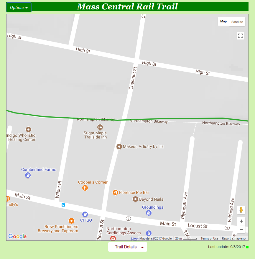
This dataset was collected by the Pioneer Valley Planning Commission (PVPC) and counts the number of people that walked through a sensor on a rail trail during a ninety day period. A rail trail is a retired or abandoned railway that was converted into a walking trail. The data was collected from April 5, 2005 to November 15, 2005 using a laser sensor placed at a location north of Chestnut Street in Florence, MA.
The dataset contains the following variables:
| Variable | Description |
|---|---|
hightemp |
daily high temperature (in degrees Fahrenheit) |
lowtemp |
daily low temperature (in degrees Fahrenheit) |
avgtemp |
average of daily low and daily high temperature (in degrees Fahrenheit) |
season |
indicates whether the season was Spring, Summer, or Fall |
cloudcover |
measure of cloud cover (in oktas) |
precip |
measure of precipitation (in inches) |
volume |
estimated number of trail users that day (number of breaks recorded) |
weekday |
indicator of whether the day was a non-holiday weekday |
Questions
In the
rail_traildataset, how many rows are there? How many columns? Which variables in the dataset are continuous/numerical and which are categorical?Create a histogram of the variable
volumeusing the following code:ggplot(data = rail_trail) + geom_histogram(mapping = aes(x = volume))Describe the shape and center of the distribution. Afterward, try adjusting the size of the histogram bins by adding the
binwidthinput. To start with, usebinwidth = 21. If you need help with where to placebinwidth, read the documentation by running?geom_histogramin your Console window. Then, find a binwidth that’s too narrow and another one that’s too wide to produce a meaningful histogram.Create a histogram for each of the remaining numerical variables, and describe the shape and center of each distribution. Are there any distributions that are similar in shape to each other?
Use
geom_point()to create a scatterplot that plotsweekdayversusseason. Why is this plot not useful?Create a mosaic plot using the same variables you considered in question 4:
ggally_ratio(data = rail_trail, mapping = aes(x = season, y = weekday)) +
  coord_equal()
Which square in the mosaic plot takes up the most space? Explain the meaning of the different size squares in the mosaic plot and what information it contains that is missing in the previous scatter plot.
Run
?geom_barin the Console window and read the documentation forgeom_bar(), and then look at the entry for it on the ggplot2 cheatsheet Usegeom_bar()to reproduce the following bar chart: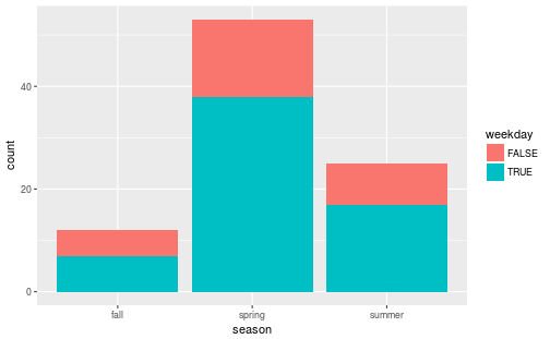
After reproducing the plot, explain what the height of each bar means.
Starting from the code snippet you deduced in question 6, create two more bar charts:
Create a bar chart by supplying the input
position = "dodge"togeom_bar()Create a bar chart by supplying the input
position = "fill"togeom_bar().
After creating the visualizations, describe the feature that
positioncontrols.Create a bar chart that maps its aesthetic
aes()toprecip > 0. Interpret what this bar chart means.Create a scatter plot of
volumeversushightempusinggeom_point(). Describe any trends that you see.Take the code snippet you wrote for question 9 and map the
weekdayvariable tocolor. Then create a second plot where, instead of mappingweekdaytocolor, you facet overweekdayusing eitherfacet_wrap()orfacet_grid(). Discuss the advantages and disadvantages to faceting instead of mapping to thecoloraesthetic. How might the balance change if you had a larger dataset?Take the code snippet that you wrote down in question 10 that faceted over
weekdayand create a model for each facet panel usinggeom_smooth(). Discuss the trends in the number of rail trail users thatgeom_smooth()picks up.Copy the code snippet you deduced in question 11 and use the input
se = FALSEforgeom_smooth(). What does theseinput option forgeom_smooth()control?